
Equipping Parents to Make the Best Health Care Decisions for Their Child
Boston Children's Hospital
Overview
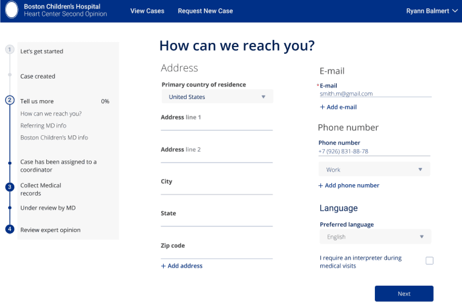
A Second Opinion is when a family decides to receive another medical professional's opinion on a serious medical procedure. Before this project, Boston Children's Hospital outsourced its Second Opinion Portal. Business needs were to use our own branding, cut costs, and provide a more understood experience for patients. From the ground up, I worked with developers and medical professionals to design the new portal. I delivered components, typography, and layout for a web application including form completion and a user profile flow. I focused on implementation workload, responsive design, accessibility, and identity.
Team
Lead Designer & Developer (Me)
Full Stack Engineer Lead (Manager)
Cardiac Surgeon (Stakeholder)
Nurse (Stakeholder)
Cardiology Admin (Product Owner)
Research Process
Redesigning Unique Form Pages
Single Column Form UX Research
I presented to my team and implemented single-column forms and adjusting typography for input fields. The original was two columns on a desktop and switched to one column for tablet view. I read multiple articles about UX practices, and a common theme was that readers overwhelmingly have trouble completing forms that are not strictly vertical or strictly horizontal. I presented this to my team and communicated the advantages of staying single column, including accessibility and more form completions with fewer errors.
Input Field UX Research + Type Hierarchy
Some truths I researched:
Top-aligned field labels are great for most forms and perfect for forms that ask for familiar data.
Right-aligned field labels are useful for slowing down the user and decreasing errors.
Left-aligned field labels take users the longest to fill out a form but are perfect for slowing down the user when entering unfamiliar pieces of data. These labels also help you decrease the number of errors and any bad data that you might receive.
I also decided to adjust the hierarchy of the page, especially the input fields. I chose to keep the input field text top aligned, or above the input field because this had the quickest completion time, and UX best practices suggest this to be most readable. There weren't many fields, so the vertical spacing wasn't a major concern, either. I decided to decrease the weight of input labels, and highlight key information while making elements like input borders less visible to help guide the reader through the form.

Brand Identity and User Experience
The Boston Children's Hospital branding refreshed the year before. I had to consider keeping the identity of the web application I was in charge of creating looked secure and in line with both styling of the main website and the app that accompanied the web application. I achieved this by using some of the new brand elements like the new header and footer, and I also made the sidebar match the existing sidebar menu. Both sidebars served different purposes, so I had to keep that in mind. I kept the flow similar to the mobile app so that users could seamlessly use either the web application or iPhone/android app to check their profile and continue their process.

Next Steps
In retrospect, I would have liked to explore A/B testing on the CTA buttons. We did not have a content specialist, just the existing content from before. It would be worth the effort to research more about CTAs to increase completion and the overall user process in our web application.
ethanwatsonj88@gmail.com