
Designing for Mobomo and its clients
Mobomo – Digital and Print Designs
Overview
I've been working full-time at Mobomo for almost two years. Most of the time, I am a UX Designer creating mockups and user experiences on various contracts with many different clients. Sometimes, I will assist with graphics or print material as well, for clients or for Mobomo itself.
How can we get a community to teach themselves?
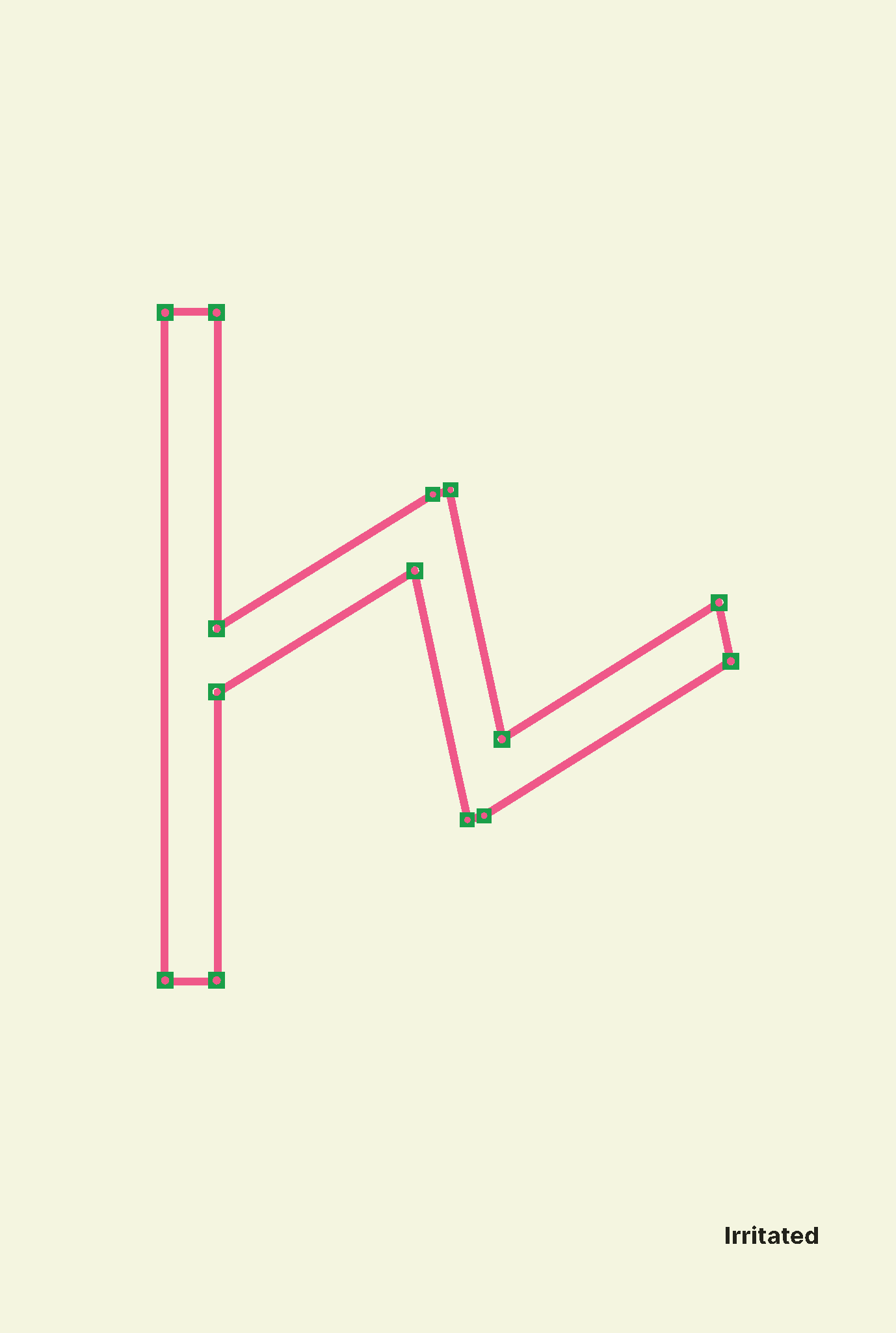
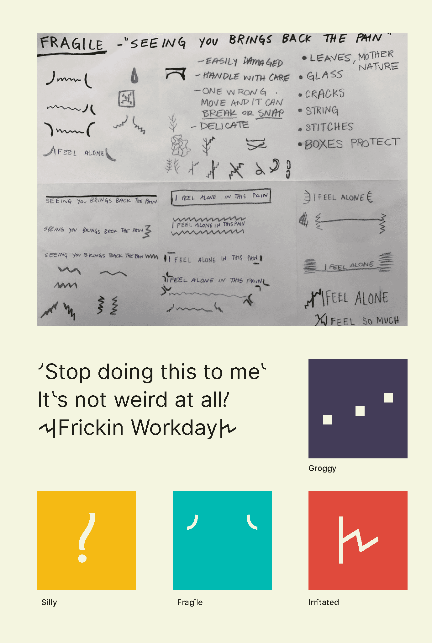
That was the big question. Design education should inherently be experiential and collaborative. So, we wanted to create an interactive activity where participants learn about typographic forms from each other. We decided on activity cards.
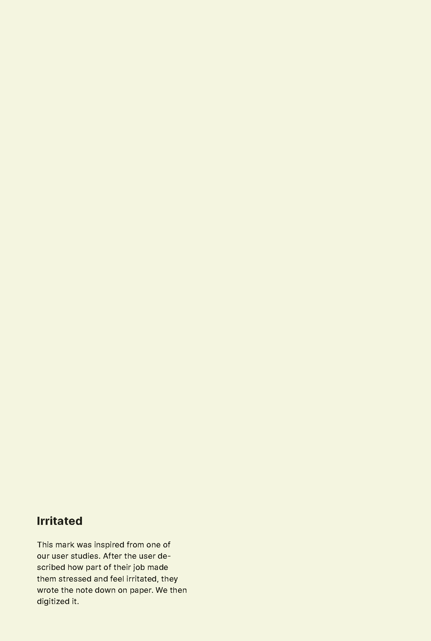
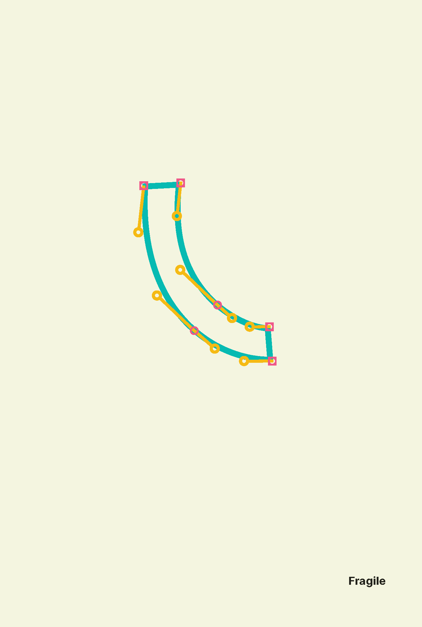
Originally, we planned to use pinned-up folded activity cards. The front provided a surface for the participant to draw their mark and the back had a quote relating to the emotion. However, after some user testing, we concluded that most people found this layout confusing. Our final iteration uses a polaroid shape format to lay out the individual activity. Polaroids are symbolic of community and familiarity. This format allowed participants to quickly complete and compare marks with each other.
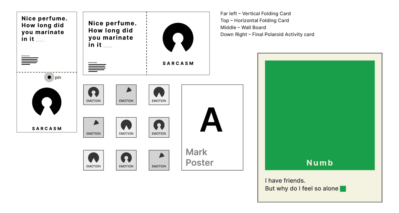
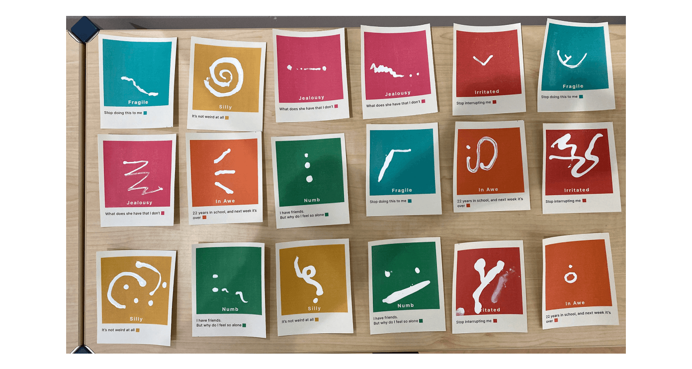
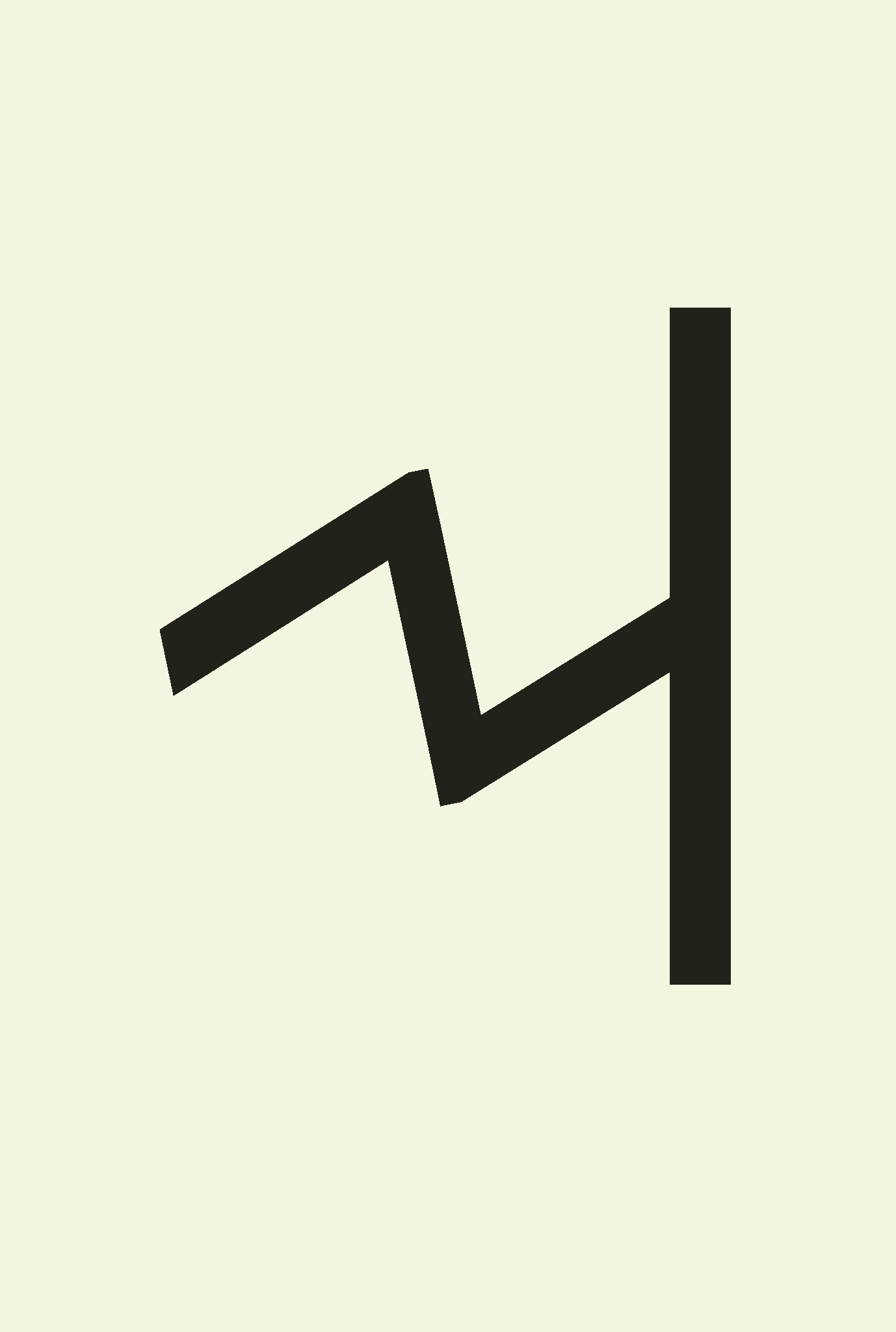
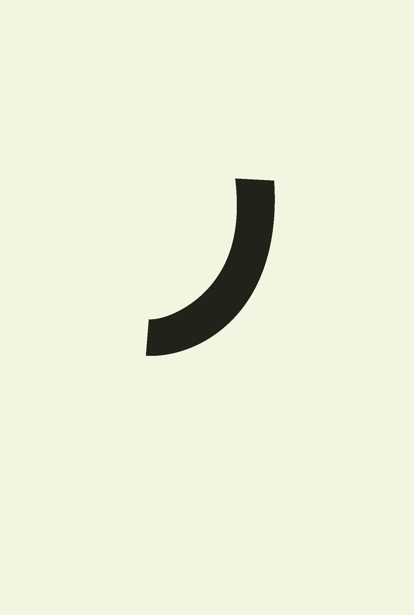
Initially, we wanted participants to finger paint their marks. However, the thick paint proved to be too messy and not legible. After several more prototypes, we discovered that the roller pen on card stock created the best-looking result, especially on a gesso surface.
Identity
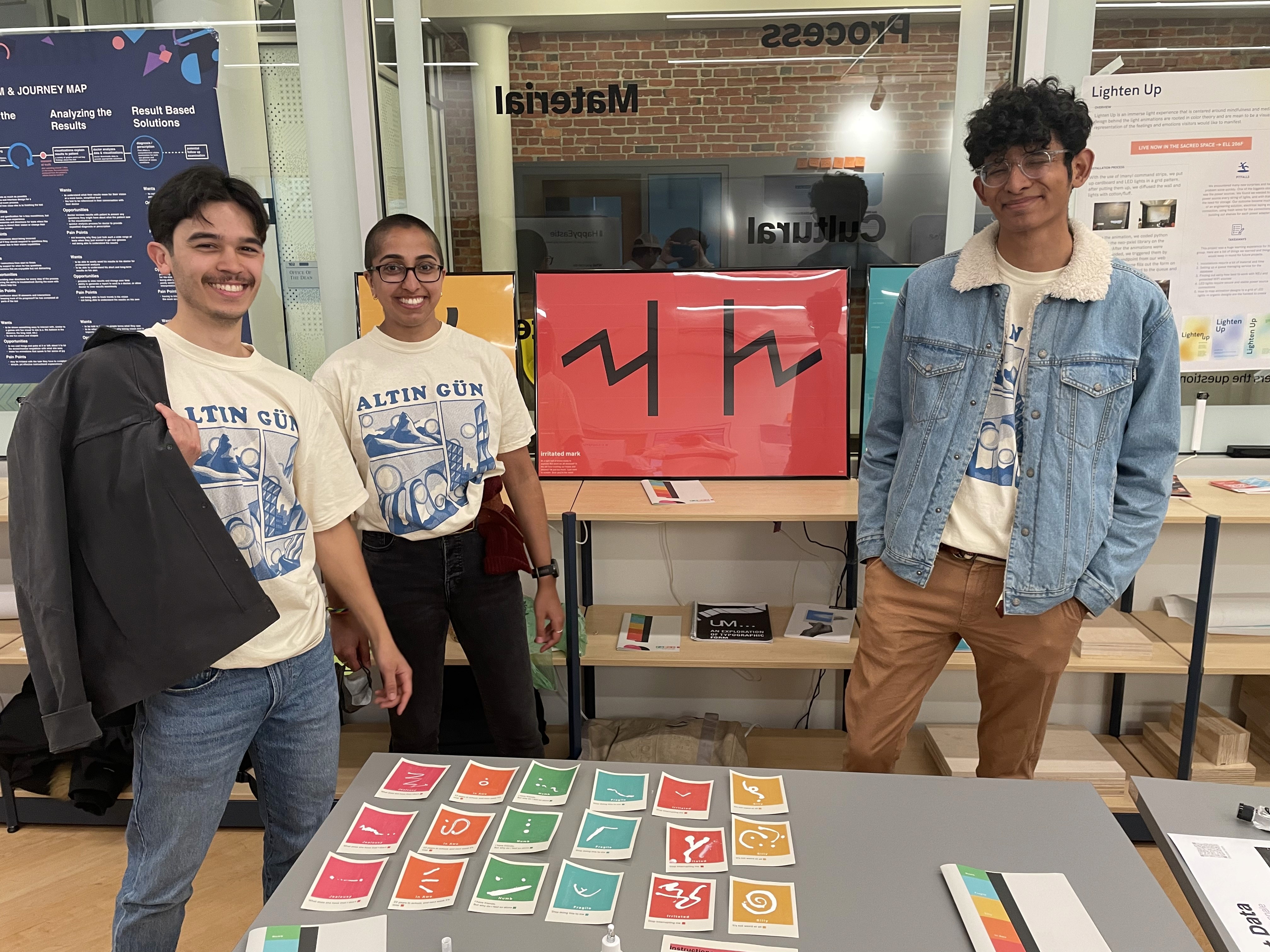
To tie our presentation materials together, I created an identity that drew people to our exhibition, kept them engaged, and explained our project: let's make typography fun.
Halfway through our project, our exhibition looked like this:
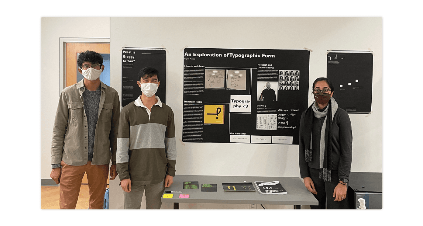
At the exhibition, one group shone above the others. Their project was about toys, and heavily inspired our final identity. We then pursued a brighter, more fun way to show our creativity and the kid side of the project.
The square blocks are inspired by pre-school ABC blocks. These wood blocks are often used to teach basic letter shapes to children. This was fitting for a project that introduces typography.
In addition, the blocks innately create a modular design system. We used these blocks for holding content, creating patterns, and building punctuation marks.
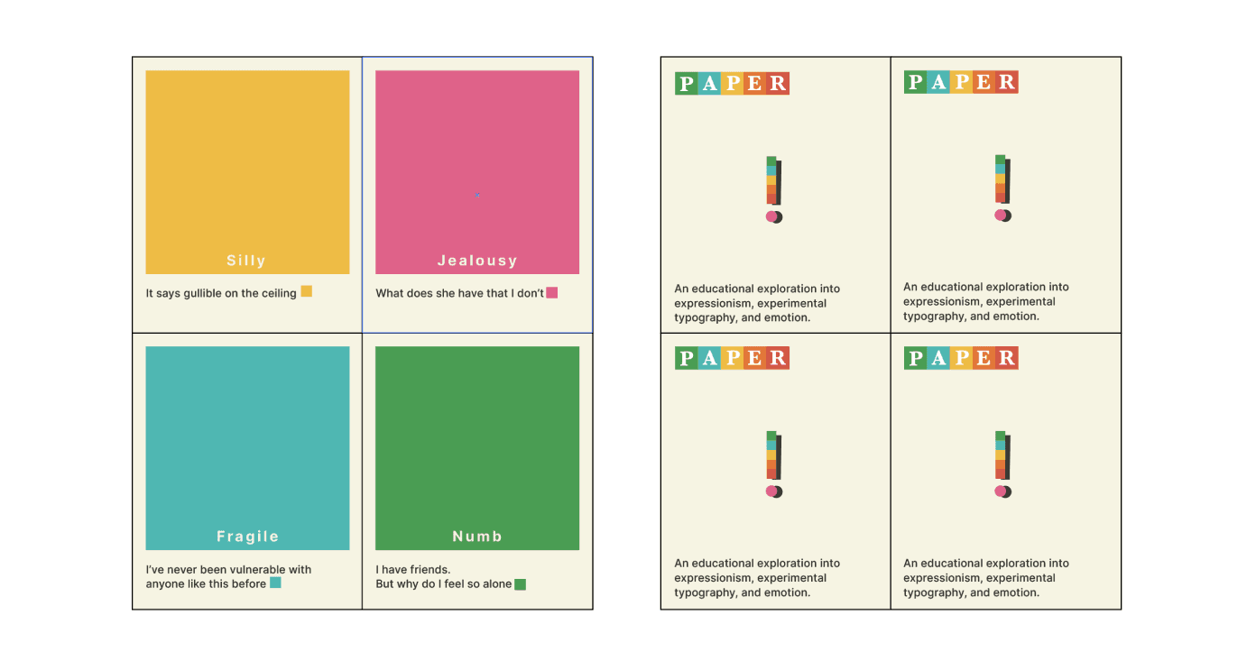
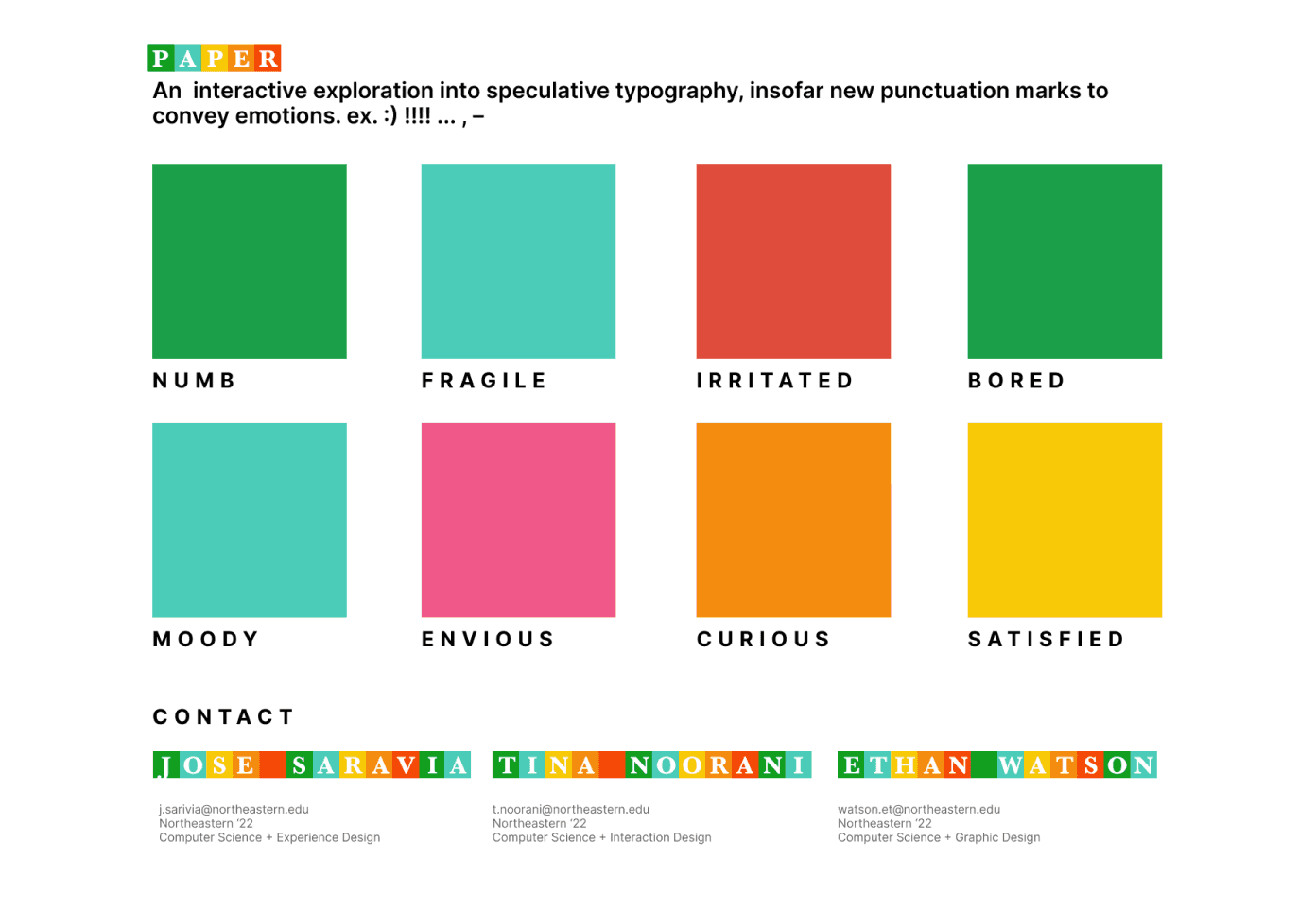
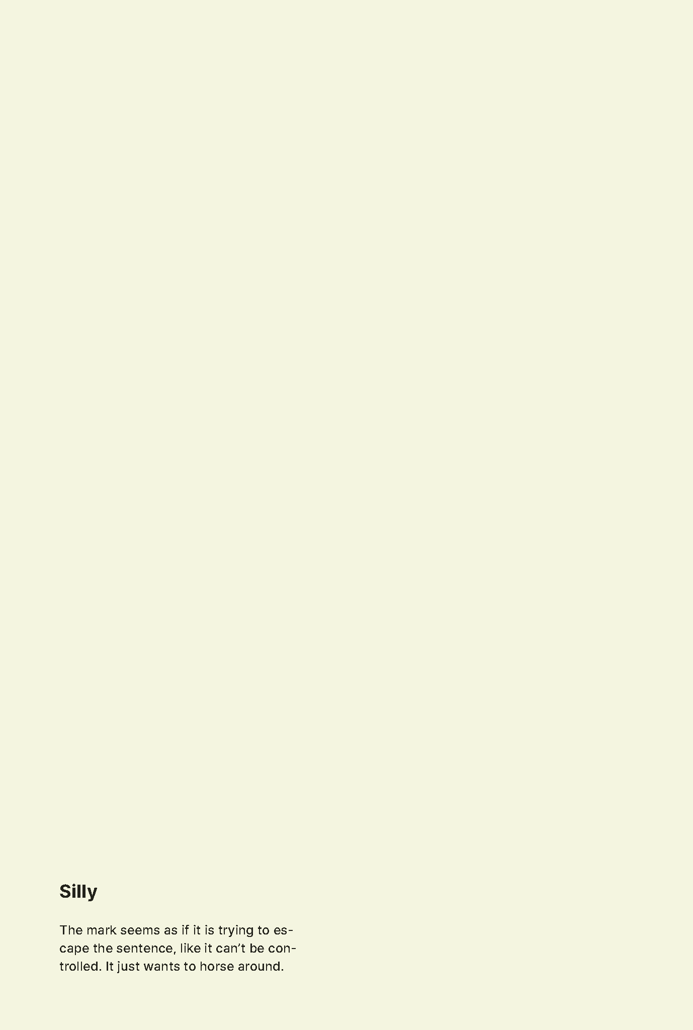
Our color palette is based on the six emotional categories we explored. We placed greater emphasis on specific colors by using different values. For example, heavy emotions are red, and yellow represents lighter emotions.
Mini-zine
The mini-zine was our solution to letting designers take the project home with them to remember.


ethanwatsonj88@gmail.com