Pacific Marine Environmental Laboratory

Featuring Researchers and Their Publications

Overview

The Pacific Marine Environment Laboratory (PMEL) is a research institution focused on the Pacific Ocean and its interactions with the atmosphere. Their website is a hub for higher education and public information about oceanography and environmental science. As the lead designer, I ran discovery sessions, gathered meaningful observations from user interviews, and created a refreshed web experience for their site.

Impact

We identified and resolved users' main complaint of not being able to connect with researchers and their work.

The site became more intuitive to navigate and reflects more accurately the company's mission and values. We involved high school students and employees throughout the design process, allowing them to have a direct hand in the redesign of the site. This research and design project was handed off to PMEL developers to be released in 2024.

The Problem

During discovery, we identified most of the problems through Card Sorting activities, Usability Interviews, and requirement gathering.

Researchers Needed Highlighting

The majority of people came to the site to look up researchers and publications. We found that the site never connected researchers to their publications.

Navigation Not User-Centered

Site structure was categorized by internal organization, not how users mentally grouped the pages.

Hidden Information

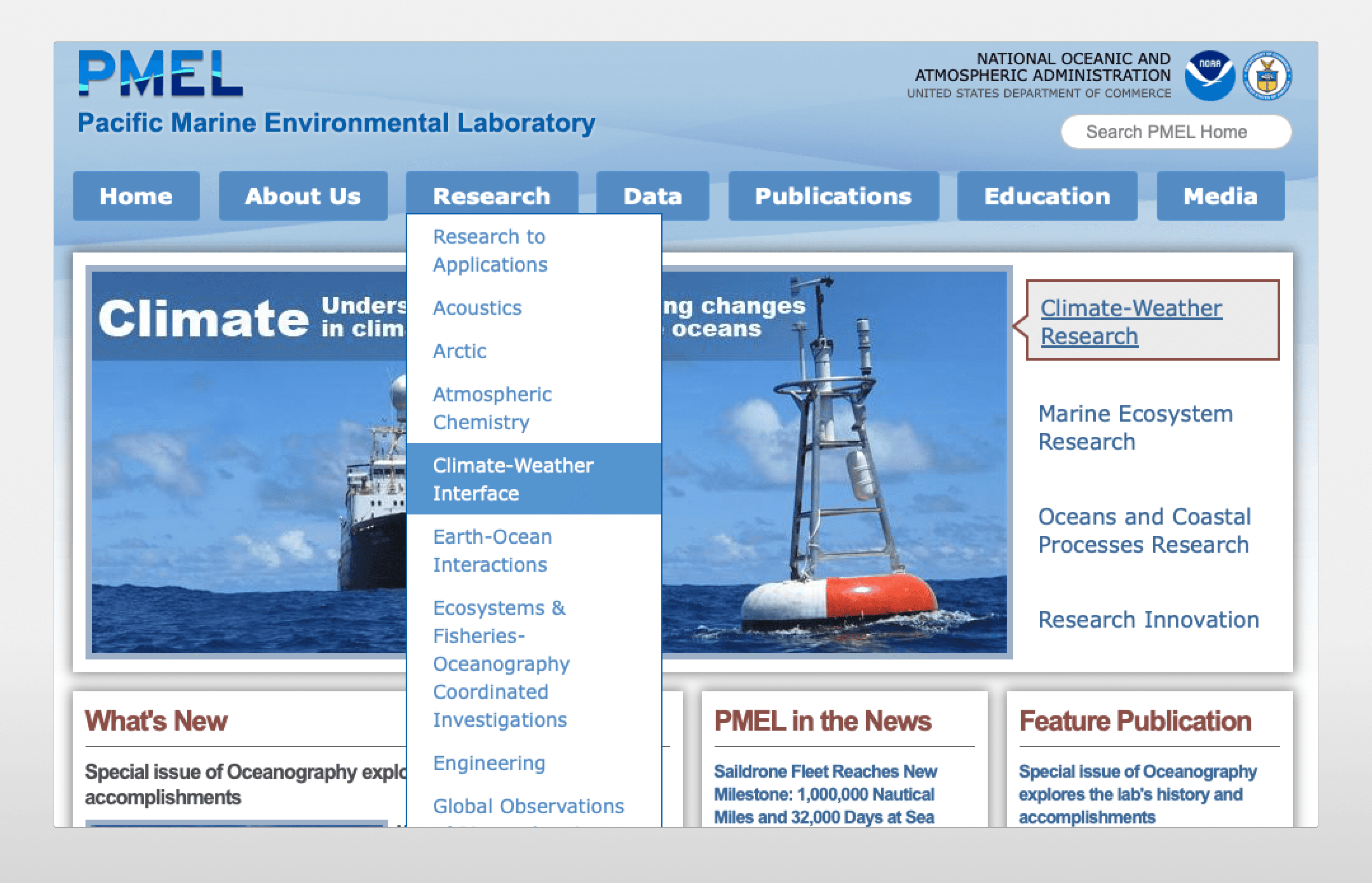
Research Lab Groups' data, images, and pages were hidden within a navigation menu that repopulated the main menu, making it impossible to go up and down levels of navigation.

Client Wanted a UI Refresh

While keeping in line with their parent organization’s styling, NOAA/OAR, the client wanted the site to represent the high caliber research that was happening at PMEL.

A refresh was in the making that focused on how users will view, navigate, and interact with PMEL.

Goals

We planned to refresh the experience & style of the site to match client expectations while bolstering PMEL as a premier research laboratory. By highlighting researchers, using a navigation system that users understand, and designing a brand that is exciting and professional, we will have resolved the issues that we discovered with the site during the discovery phase.

Design Solutions

Highlighting Researchers and Their Publications

During discovery, we learned that users primarily visit the site to learn more about certain researchers and the work they are publishing. Sometimes they wanted to find contact information, too.

To support this, we

  • pushed publications to be a main focus on the homepage

  • made publications link to their respective researchers

  • listed publication and articles on researcher pages

that way, users could cyclically browse through researchers and their publications.

Homepage links Publications, Publications link Researchers, Researchers link to their Publications.

Categorizing a Navigation Menu for Users

Navigation was categorized by the internal structure of the groups and document type. That means labs were in one dropdown, while their publications and parts of their data visualizations were in a separate dropdown.

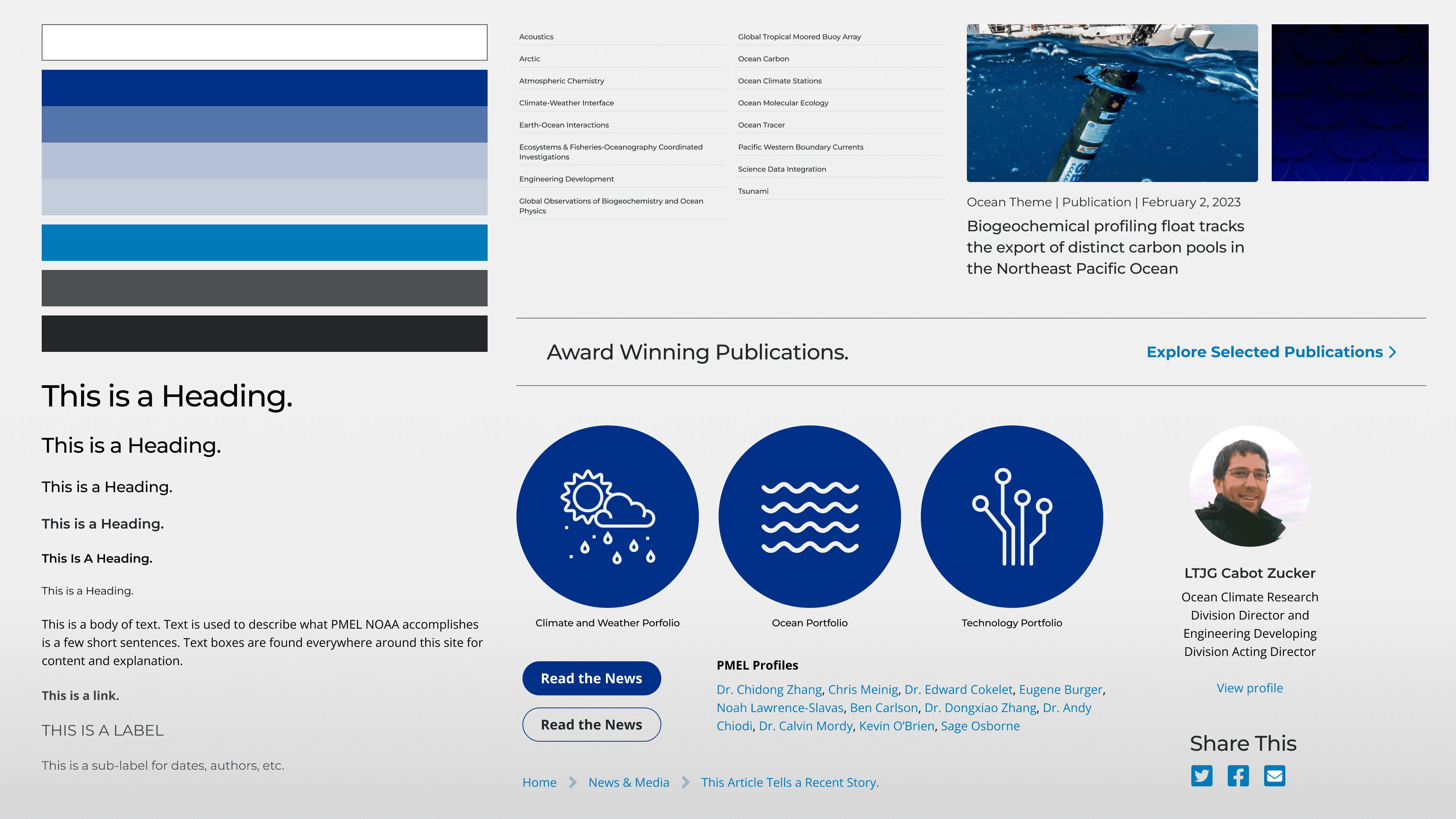
To fix this, we changed navigation menus to follow users and how they categorize by topic. Now, research groups own their data, images, and publications rather than a separate entity. We also included topics on the right that users frequently visit.

Designing a Brand that is Exciting and Professional

During the refresh of the site, we needed to design the site with its parent organizations guidelines in mind while giving the site its own distinct flavor. We decided on taking inspiration from science museums, science journal sites, and MIT.

Another key aspect was the need to minimize image importance and focus on content. While it would be nice to have large, captivating images, images were limited for PMEL since most would be of low image quality. This worked hand in hand, however, since we wanted to focus on researchers and their written works, articles, and news.

Reflection

My key takeaways were:

  • A strong project plan leads to a successful execution.

  • Working LEAN doesn’t mean UXR has to disappear!

The hardest part about this project was planning. The timeline went by quickly and I had other projects occurring in tandem. Making sure that meetings were productive, the right meetings were scheduled, and making sure requirement gathering and approvals happened swiftly took careful planning on myself and my team to successfully wrap this project up.

Get in Touch

About

Ethan leads and supports product lifecycles from strategy to launch. He has experiences crafting user experiences, identities, and seamless digital interactions. This portfolio is a reflection of the current work of Ethan Watson

Pacific Marine Environmental Laboratory

Featuring Researchers and Their Publications

Overview

The Pacific Marine Environment Laboratory (PMEL) is a research institution focused on the Pacific Ocean and its interactions with the atmosphere. Their website is a hub for higher education and public information about oceanography and environmental science. As the lead designer, I ran discovery sessions, gathered meaningful observations from user interviews, and created a refreshed web experience for their site.

Impact

We identified and resolved users' main complaint of not being able to connect with researchers and their work.

The site became more intuitive to navigate and reflects more accurately the company's mission and values. We involved high school students and employees throughout the design process, allowing them to have a direct hand in the redesign of the site. This research and design project was handed off to PMEL developers to be released in 2024.

The Problem

During discovery, we identified most of the problems through Card Sorting activities, Usability Interviews, and requirement gathering.

Researchers Needed Highlighting

The majority of people came to the site to look up researchers and publications. We found that the site never connected researchers to their publications.

Navigation Not User-Centered

Site structure was categorized by internal organization, not how users mentally grouped the pages.

Hidden Information

Research Lab Groups' data, images, and pages were hidden within a navigation menu that repopulated the main menu, making it impossible to go up and down levels of navigation.

Client Wanted a UI Refresh

While keeping in line with their parent organization’s styling, NOAA/OAR, the client wanted the site to represent the high caliber research that was happening at PMEL.

A refresh was in the making that focused on how users will view, navigate, and interact with PMEL.

Goals

We planned to refresh the experience & style of the site to match client expectations while bolstering PMEL as a premier research laboratory. By highlighting researchers, using a navigation system that users understand, and designing a brand that is exciting and professional, we will have resolved the issues that we discovered with the site during the discovery phase.

Design Solutions

Highlighting Researchers and Their Publications

During discovery, we learned that users primarily visit the site to learn more about certain researchers and the work they are publishing. Sometimes they wanted to find contact information, too.

To support this, we

  • pushed publications to be a main focus on the homepage

  • made publications link to their respective researchers

  • listed publication and articles on researcher pages

that way, users could cyclically browse through researchers and their publications.

Homepage links Publications, Publications link Researchers, Researchers link to their Publications.

Categorizing a Navigation Menu for Users

Navigation was categorized by the internal structure of the groups and document type. That means labs were in one dropdown, while their publications and parts of their data visualizations were in a separate dropdown.

To fix this, we changed navigation menus to follow users and how they categorize by topic. Now, research groups own their data, images, and publications rather than a separate entity. We also included topics on the right that users frequently visit.

Designing a Brand that is Exciting and Professional

During the refresh of the site, we needed to design the site with its parent organizations guidelines in mind while giving the site its own distinct flavor. We decided on taking inspiration from science museums, science journal sites, and MIT.

Another key aspect was the need to minimize image importance and focus on content. While it would be nice to have large, captivating images, images were limited for PMEL since most would be of low image quality. This worked hand in hand, however, since we wanted to focus on researchers and their written works, articles, and news.

Reflection

My key takeaways were:

  • A strong project plan leads to a successful execution.

  • Working LEAN doesn’t mean UXR has to disappear!

The hardest part about this project was planning. The timeline went by quickly and I had other projects occurring in tandem. Making sure that meetings were productive, the right meetings were scheduled, and making sure requirement gathering and approvals happened swiftly took careful planning on myself and my team to successfully wrap this project up.

Get in Touch

About

Ethan leads and supports product lifecycles from strategy to launch. He has experiences crafting user experiences, identities, and seamless digital interactions. This portfolio is a reflection of the current work of Ethan Watson